I have chose to define the audience for this magazine:
http://iwantigot.geekigirl.com/wp-content/uploads/2009/09/200909_FashionMagMens2009c.jpg
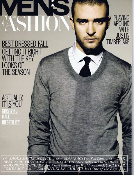
This magazines audience is for men who are between the ages of 20-30 that are interested in designer brand fashion and who earn quite a high income.
I would say this magazine is for the ages between 20-30 because for the centre image for this magazine, they have Justin Timberlake,he is around that age, and also magazines tend to put someone as the cover image because they are idols to the particular magazine.
I also think that this magazine it for people that are quite high up the socio-economic group because of the way the magazine is laid out. There isn't much cover lines and extra information about what is inside this magazine, so it shows that this magzine isn't "gossipy" and that giving you plenty of information isn't this magazines way of selling itself. And quite often people who are higher up in the socio-economic don't tend to interested in celebrities lives.
The other thing I have realised is that the font of it all its in capital letters, this can show that mean who buy this magazine are quite dominant and powerful, which can suggest that the audience of this magazine has quite a high status.
Sunday, 25 September 2011
Monday, 19 September 2011
Connotation & Denotation, Sans Serifs & Serifs
Denotation: The actual names for certain parts of a magazine. E.g. the title of the magazine is actually called Masthead.
Connotation: The reason why the editors have done this. E.g. Using the colour red connotates that something is "dangerous" or "hot".
Sans Serifs: Means "without" and is a font that has no "extra bits" that stick out on each lettering. E.g. the font Verdana is a sans serif
Serifs: Means "with" therefore serifs are fonts with "extra bits" that stick out on each lettering. E.g. the font Times New Roman is a Serif font.
Sans Serifs fonts are known to be more "modern" and sometimes not as informal as Serifs fonts.
Serifs fonts are known to be more formal and more traditional, and that is why serifs fonts are usually used for more serious media texts like newspapers.
Monday, 12 September 2011
Conventions & Codes.
Two words: Conventions and Code
We learnt about the two words when we were doing about magazines.
Conventions: The similarities in the magazines
Code: the differences between magazines
The two magazine that I was comparing was Elle and Bella and the conventions between the two are that both the title of the magazine were covered with the centre image. They both had promotional offers on the front cover. and they were many more connotations.
And the codes were that the magazine had only one image on the front cover rather than a few like the magazine Bella. One of the biggest differences between the two magazine would be that the topic of celebrities is mentioned differently. In Bella, when celebrities are mentioned, they were mentioned in quite a gossipy way, where as in Elle, they are mentioned because of their fashion as Elle is a fashion magazine.
Subscribe to:
Posts (Atom)
