Saturday, 24 December 2011

Music - Pixie Lott

Pixie Lott has quite a few new songs, and they're all quite good, the three newest songs ive heard are All About Tonight, Coming which features Jason Derulo And What Do You Take Me For? which features Pusha T.


All About Tonight


What Do You Take Me For?


I'm Coming Home


Monday, 12 December 2011

Media Pack

Here is my media pack for my magazine FRESH. My powerpoint explains the advertisment, the ideal reader and their interests.


Tuesday, 6 December 2011

We've been looking at single page spreads in magazines, and the article are based on the same artist. Little Boots.  And we've been looking at conventions of magazines.

Mixmag VIP


 NME Radar


The image from mixmag seems to describe Little Boots more, it shows her personalitiy and her environment.  Little Boots is a musician and so having a keyboard, recorder, tambourine, headphones and a little notepad sums up and makes it obvious that she is a musican and a songwtiter.  Whereas Little Boots in NME Radar, it seems more proffesionally taken, her hair and make-up are exaggerated and the pose that Little Boots is in makes her seem much more confident than her in Mixmag.
These two articles are based on the same person, but the way in which the article is written makes it seem like they are two different people.  In Mmixmag, it starts off with a little factifil of Little Boots, the paragrapghs are much smaller, and the article itself is simply quite factual.  But in NME, there are much more quotes from Little Boots herself.  It also has a lexical field of space, (words including space, galaxy, space cadet).  This summerarises what kind of music genre she represents. 
The layout of both magazine are similar in a way the main focus is the image, and so the image takes up most of the page, and the article is only a small column.  The article in NME looks more little a little pop up as there is space around it, rather than "stuck" to the side of the page like Mixmag.

Wednesday, 9 November 2011

Music Magazine Covers


This magazine cover stood out for me as it is unique and very original.  Is it not very often that you see magazine covers like this.
It appears to both genders as it has image of both gender.  Also it’s quite obvious who the target audience are.  This would be ages 17+ that enjoy music such as indie, rock, and r n b.  This is because of the people in the image.
There are no cover lines or subheadings which again, makes this magazine different.  Having no cover lines means that it looks like a poster, which means that readers who find this magazine interesting can rip this out and use it as a poster.


Again, this magazine is very different.  I like it because there is nothing to it but something that seems like coloured squared or a very zoomed in pixelated image. 
There isnt again cover lines so it looks more like a poster.


I like this magazine poster because its fun, and also it shows different sides of the peoples characters. 
also its has a specific colour theme so it attracts attention.  The images are black and white, which is quite unusual but it works.

Tuesday, 8 November 2011

The Kooks

I brought The Kooks new album the other day, Junk Of The Heart.  and i quite enjoy it as i really like The Kooks.  But what I found out was that this album of thiers, is quite different to the other ones.  This one is quite toned down, its not as upbeat as the others which i dont like very much.


I've realised that quite a lot of artist do this, they are known as a rock/pop band, but then they slowly tone it down and turn into pop.. which isnt really my style.  Mcfly has also done this, their newest album Above The Noise is much slower and calmer than the rest of their album.  its liek they want to get into the charts and so they become pop.

Wednesday, 26 October 2011

The making of my contents page...

For the best outcome, it is better that the cover and the contents page had the same kind of design to it.  And I realised that my cover is quite simple so I decided that I would go the same direction with my contents page.


To do this, i used photoshop again.
I put the masthead at the top, and again I got that font from dafont.  Then I produced a a editors letter.  And because inside the editors letter, I had said about the fun whilst taking the "photoshoot", I put a few photos that went wrong to show that we had fun.  
Underneath, there were the pages and information you needed.  I put the information inside grey boxes so that they would stand out, and at the same time the whole design of the page would look simple.


This is my developed contents page:

The making of my magazine cover...

I used photoshop to produce my magazine cover, and I used many different techniques to do this.


This is the image that I took and chose to use for my magazine cover.
 I wanted the background to be simply white and to do this I had to erase the whole background.
I used 
I also used photoshop to help me change the image. I made the colours of the image shaper, and used the "clone" and "blur" tool to help my models skin look nicer. 


And to create the the background, I went onto a site called dafont.com and chose the fonts I wanted to used. and placed it wherever I wanted in the background.  Then I added a bar code so that it looks like a real magazine.
And this is what I finished with:


Wednesday, 19 October 2011

Magazine Covers

Out of the three magazine covers that I have looked at, this is the one that caught my attention the most.  This is because the background is very original.  And if I do something like that for my own magazine, it is up to me what font I use and how creative I want my cover to be.


And here is my final piece.  My complete magazine cover. 

Research of other magazines

To produce my own magazine, I had to do some research on some magazine covers that I like.  and here are a few of my favourite ones, and i have analysed them.


Elle is a women’s fashion magazine.
The image is a studio shot; we can tell this as this image is a posed position. 
The image is edited we can tell this by the eyes. 
The colours of they eyes are the same colour as the masthead.
There is only one image on the cover, this shows that there is only really one main focus for this months issue.
All of the colours used for this cover magazine are quite soft. And the colour of the font and the background of the image all match, and are all the same colours.
The font is rounded; this can show that the magazine is quite feminine.


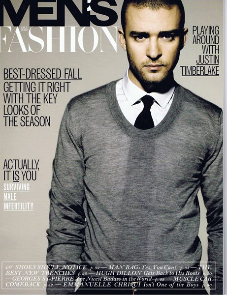
Men’s fashion magazine.
A studio shot, again like the elle magazine this is a posed position. And the background is there on purpose.
The pose is a man stood up, this shows status.
Cover lines are written in capital letters, this can also be another way to show power.  And it also stands out more.
Colouring of the writing is simply black or white.  So its more noticeable and stands out more.


Men’s fashion magazine
It is a posed position
The background is created purposely for this issue.  And it is in black and white.
The image is also in black and white but it stands out from the background.
The masthead is in a different colour, and in yellow because that colour attracts more attention.
The fonts of the cover lines are all different but they do not clash.
The font is capital letters to show power and status and its more noticeable.

Sunday, 25 September 2011

Defining Audience for a certain Media text

I have chose to define the audience for this magazine: 


http://iwantigot.geekigirl.com/wp-content/uploads/2009/09/200909_FashionMagMens2009c.jpg


This magazines audience is for men who are between the ages of 20-30 that are interested in designer brand fashion and who earn quite a high income.
I would say this magazine is for the ages between 20-30 because for the centre image for this magazine, they have Justin Timberlake,he is around that age, and also magazines tend to put someone as the cover image because they are idols to the particular magazine.  
I also think that this magazine it for people that are quite high up the socio-economic group because of the way the magazine is laid out.  There isn't much cover lines and extra information about what is inside this magazine, so it shows that this magzine isn't "gossipy" and that  giving you plenty of information isn't this magazines way of selling itself.  And quite often people who are higher up in the socio-economic don't tend to interested in celebrities lives. 
The other thing I have realised is that the font of it all its in capital letters, this can show that mean who buy this magazine are quite dominant and powerful, which can suggest that the audience of this magazine has quite a high status.

Monday, 19 September 2011

Connotation & Denotation, Sans Serifs & Serifs

Denotation: The actual names for certain parts of a magazine. E.g. the title of the magazine is actually called Masthead.
Connotation: The reason why the editors have done this.  E.g. Using the colour red connotates that something is "dangerous" or "hot".

Sans Serifs: Means "without" and is a font that has no "extra bits" that stick out on each lettering. E.g. the font Verdana is a sans serif
Serifs: Means "with" therefore serifs are fonts with "extra bits" that stick out on each lettering. E.g. the font Times New Roman is a Serif font.

Sans Serifs fonts are known to be more "modern" and sometimes not as informal as Serifs fonts.
Serifs fonts are known to be more formal and more traditional, and that is why serifs fonts are usually used for more serious media texts like newspapers.


Monday, 12 September 2011

Conventions & Codes.

Two words: Conventions and Code 
We learnt about the two words when we were doing about magazines.

Conventions: The similarities in the magazines
Code: the differences between magazines

The two magazine that I was comparing was Elle and Bella and the conventions between the two are that both the title of the magazine were covered with the centre image.  They both had promotional offers on the front cover.  and they were many more connotations.
And the codes were that the  magazine had only one image on the front cover rather than a few like the magazine Bella.  One of the biggest differences between the two magazine would be that the topic of celebrities is mentioned differently.  In Bella, when celebrities are mentioned, they were mentioned in quite a gossipy way, where as in Elle, they are mentioned because of their fashion as Elle is a fashion magazine.

Thursday, 25 August 2011

The Inbetweeners Movie

I went to watch the Inbetweeners Movie, and I have to say, it has to be one of the funniest films I've ever watched.  I laughed the whole way through, the film is worth the money to watch.


The trailers didn't give to much away which I think is why everyone found it even more hilarious.


Saturday, 6 August 2011

6th August

There was an advert that caught my eye today, it was the Weetabix advert.  I quite like the advert as there was a little comedy in it.  And the selling point is that this type of Weetabix is suitable for everyone of all ages and I think it has made its point very well. 


Weetabix Minis Relaxed Breakfast


Saturday, 23 July 2011

23rd July 2011

I'm not a very big fan of Harry Potter, but I watched the last one, Deathly Hallows (Part 2) at the cinema the day it was out.  
I find Harry Potter a bit too much on the fantasy side of things, and so I don't like it much, especially this film as I feel that it hasn't got as much action as the ones before.  Although the trailer did seem quite entertaining.


The one reason why i prefer this last Harry Potter would be because the actual hero is Neville Longbottom and not Harry Potter for a change.  It makes a change and a slight twist to how harry is usually always the hero.  


I think that one of reasons why the films Harry Potter is sucsessful would be because they have a wide range of target audience and also because although there is many CGI (Computer Generated Imagery) it all looks very realistic and that is what all audience likes.
Also not to mention the very successful books that the films were made from.

Thursday, 21 July 2011

Intro

I'm Jasmine Chung, and I had taken interest in the subject Media was back in Year 9 when we had to design and produce our own magazines. I found that very fun and it had let me show my creative side. I took Media in GCSEs because I wanted to learn more about the Media and all the things connected to it.
I have chosen the subject for A-Levels because I feel that there are many areas in this industry that I havent learnt about yet. Also because I would quite liek to be a Journalist or a Fashion Magazine Editor or something relating to that area.

My Speed Meeting Media Profile

The last film i watched was Just Go With It (Starring Adam Sandler and Jenifer Aniston)
The last CD i bought was Darwin Deez
My Favourite Band is The Kooks
My Radio is usually tuned to Kiss 101
The last magazine I read was Elle
The newspaper that I am most likely to read is The Daily Mirror
If I had choose, I would rather be a journalist than a film director or an advertising executive
The song that I wish I had written is Jessie J - I Need This
The advert that has caught my eye recently is Evian